NCR Future POS - a complete, out-of-the box solution to run the entire store, simplify operations and power innovation.

To comply with my non-disclosure agreement, I have omitted and appropriated confidential information. These designs are a reinterpretation of the original. The information in this case study is my own and does not necessarily reflect the views of NCR.

My Role

  • Leadership                               
    I designed up and presented works to gain buy‐in from executives, senior stakeholders, dev leads and many other NCR teams throughout the project lifecycle.
  • Planning & Scope Definition
    I helped to define the product with my project manager partners. I evangelised customer goals, prioritised and negotiated features, balanced business goals. 
  • Oversight & Coordination
    I designed across and collaborated with developers and their PM partners to translate product features for each platform context.
  • Customer Insights & Ideation 
    I partnered with three project managers and other senior stakeholders to uncover insights and translate concepts into features that address customer behaviours and motivations.
  • Experience Strategy & Vision
    I created frameworks and prototypes to share the vision, design principles and content strategy. This helped to evangelise ideas, gain alignment and drive decision making.
  • Design Execution & Validation
    I designed down on 16 :9 / 4:3, responsive Desktop and Tablet. I executed journeys, wireframes, prototypes and design specs.
Main View

Photo Credit: NCR

The Challenge

POS Systems are Different From Regular Apps

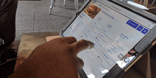
POS systems are used by cashiers in shops to process orders and to check out customers. Everyone knows how frustrating it is to have to wait in line if the shopkeeper is slow. However, that pales in comparison to the anxiety experienced by retailers when queues form.

One of the first images that come to mind when thinking of retail is of the large number of cashiers
typically laid out in stores. Perhaps more so than anywhere else, any savings in time at POSs and
cash registers, when multiplied by their (at times) vast numbers, are bound to generate huge savings
in retail chains’ operational costs.

Current POS provides an in-store retail solution, focusing on multi-format checkouts (POS), such as grocery, fuel, pharmacy and quick service as well as multi-format stores such as hypermarkets and supermarkets. 

Our challenge was to build a complete Next Generation Enterprise POS solution designed for the Digital Age. This gave us the opportunity to build product that go beyond the expected in capabilities and more. With this key principles we hoped to create deeper relationships with NCR customers:

User Centered Design

Better Experience

Responsive Display

Refreshed UI

Multi-Architecture Deployment

The Approach

Optimal interaction with both retail chain staff and shoppers.

Among Future POS’s key objectives was the ability to offer holistic user experience, as a means of maintaining enhanced retailer/shopper relationships, producing strong retailer brand identity, and increasing customer stickiness and loyalty.

While the user goal in a standard web or mobile app is achieved within the app,
in a POS system, the goal is always offline. In a way, the software application only
hampers the cashier in getting the good bagged, and the customer serviced.

Insight on best practices

  • Design for two very different scenarios: 
    • Power users who will execute the same interaction millions of times.
    • Newbies who are confronted with too much information (cashiers come and go).
  • Updates Are Difficult
    • After 2–3 weeks of using the interface for hours each day, cashiers become familiar with the interface through conditioning. Undoing these automated gestures is difficult and requires conscious override.
  • Physicality
    • The user experience of the POS is not purely digital. In fact, it is part of a larger setting that is very physical. The space around the counter, the layout of the store, the shape and size of products, the scanner, the card reader, other third party devices — they’re all part of the user experience. 
    •  Lighting issues, cashiers constantly have to refocus on objects that are at varying distances. This situation is tiring for the eyes.
  • Create Interactions, Not Buttons                                 
    • Cashiers don’t care about buttons but meaningful interactions that are finely tuned to how they work.
  • Design For Simplicity
    • Cashiers can be incredibly fast at tapping, as long as interactions make sense. 
  • Hardware components and their limitations
    • Slow systems, third party devices have to communicate with each other and/or server..
    • This may seem trivial, but it does affect the duration of every single transaction.
  • User Factors:
    • Distance From Screen
    • Time Pressure - Cashiers have to engage with the POS interface as quickly as possible in order to prevent queues from forming.
    • Attention switching is a type of executive function that is very taxing on cognitive abilities, and thus very tiring.

User Research

Retail Personas

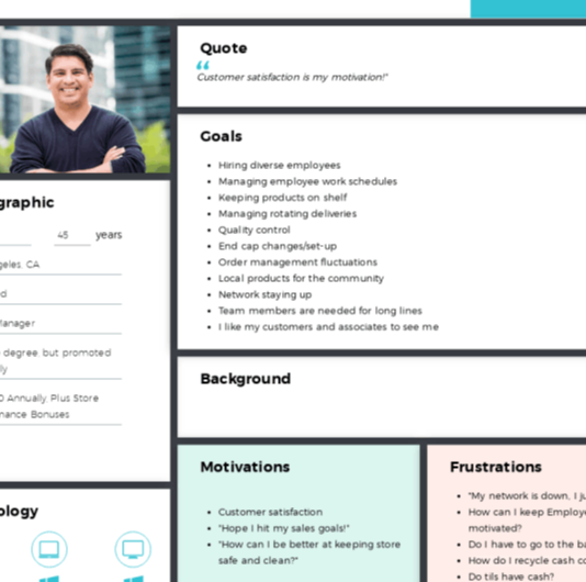
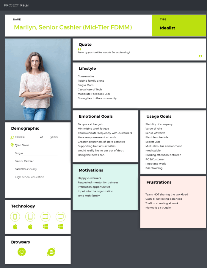
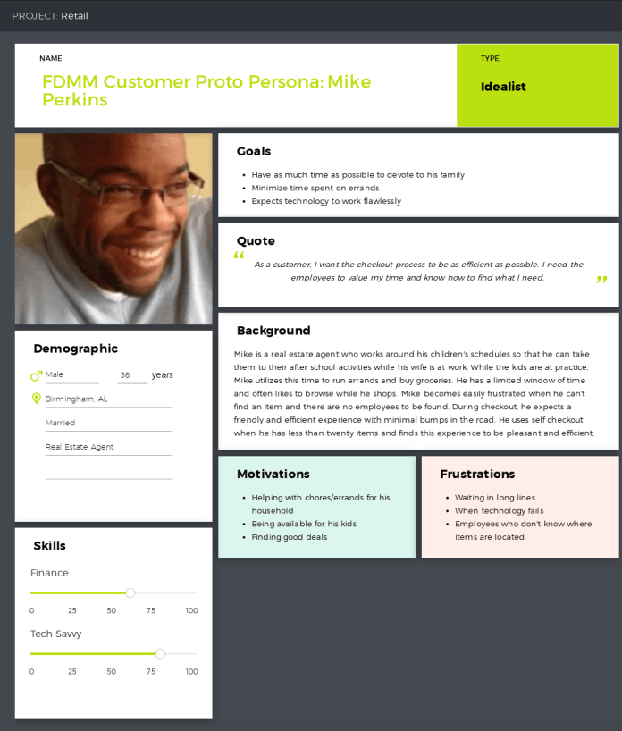
Personas reflect consumers, our employees’, and our customers’ employees as they operate within a role. These roles are independent of the tools they are using at the moment. Some of these were created by CxD Design Thinking Workshop for the Future POS project. Research was based on experience with retail, and most recently field studies with "Real Shop" cashiers, store managers, and corporate IT.

Store Manager
Senior Cashier
Customer

First Draft

The whole process went through several iterations. Feature design and development were broken into parallel workstreams for the Desktop, Mobile and Configuration Manager. I led the design for all aspects related to Desktop. 

Each feature phase of the project was serialised, starting with the design and development for the first prototype. Once each feature was designed and approved, the engineering team began the implementation.

I followed by working with other designers to translate product features for their prototype's context. I would design the next feature in the pipeline, whilst also working with my own platform engineering teams to execute the current feature through to completion.

First draft

Testing Our Assumptions

We knew we needed to put it in the hands of our customers. To setting expectations we conducted customer site visits and user testing with 21 participants including interviews with store managers and cashiers, observations on POS flows, task analysis and operations, usability testing of our initial prototype. This is highlighted the top risks in the product to be:

Based on User Feedback

  • Speed - Minimum steps to perform key tasks;
  • Ability to configure POS Dashboard;
  • Inventory support;
  • Deep navigation lacks orientation;
  • Accessibility constraints;
  • Emphasize on customer branding opportunities;
User testing
Employee and Customer  Journey Map
Employee and Customer Journey Map

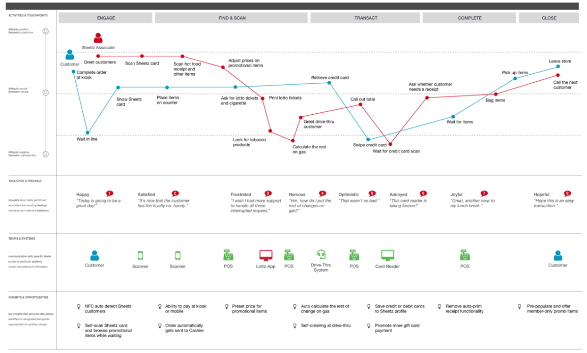
The results highlighted that we needed to prioritize the content. To disseminate the research learnings, we created a customer journey map. 

The Process

NRF 2020

The next phase was to prepare a Demo for presentation at the NRF 2020. With the research results and the inputs from key stakeholders I've taken the leadership on the design process.

Working backwards from a fixed launch date, meant that design was subsumed into an engineering‐driven process. Sign‐off milestones were driven by engineering estimates and time to create the right design was the time left over. The combination of a fixed launch date and aggressive scope created an intense environment with many coordination and time challenges.
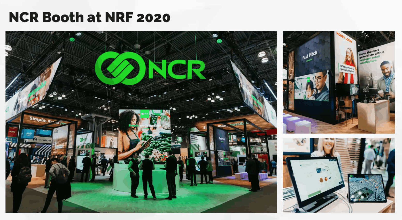
NRF

Photo Credit: NCR

Work on the Future POS in full swing

After receiving positive reviews on the NRF show, I continued to work on structuring and detailing internal flows.
For each functional feature, I went through cycles of requirements, consensus, approvals, detailed specs and handoffs.

My process involved sketching and white‐boarding concepts and flows with my PM partners and 
then translating these directly into hi‐fidelity design comps. 

The large size of this project and sprinted Agile approach meant that I needed to have everything figured out before development would commit to moving forward with the work. Many teams involved in the project needed to see it in a working prototypes. Prototyping was the most effective way to gain meaningful feedback from the team, consensus from stakeholders and approval from senior leadership. 

From Sketch to Figma

In the midst of the project, CxD management decided to move from Sketch to Figma, which is good in the long run. In the short term, this meant that I had to transfer a huge amount of mockups to Figma. I had to built a component library literally from scratch, including all the mockups and prototypes made.

It took quite a long time to do this and has shape a culture which seeks to earn trust through accountability, diving deep into the details and inviting others to scrutinies work. Heavy documentation is the artifact of such a culture.

Sketch
Figma

The Details

Complicated Navigation

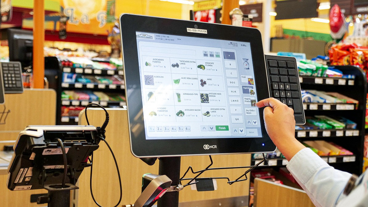
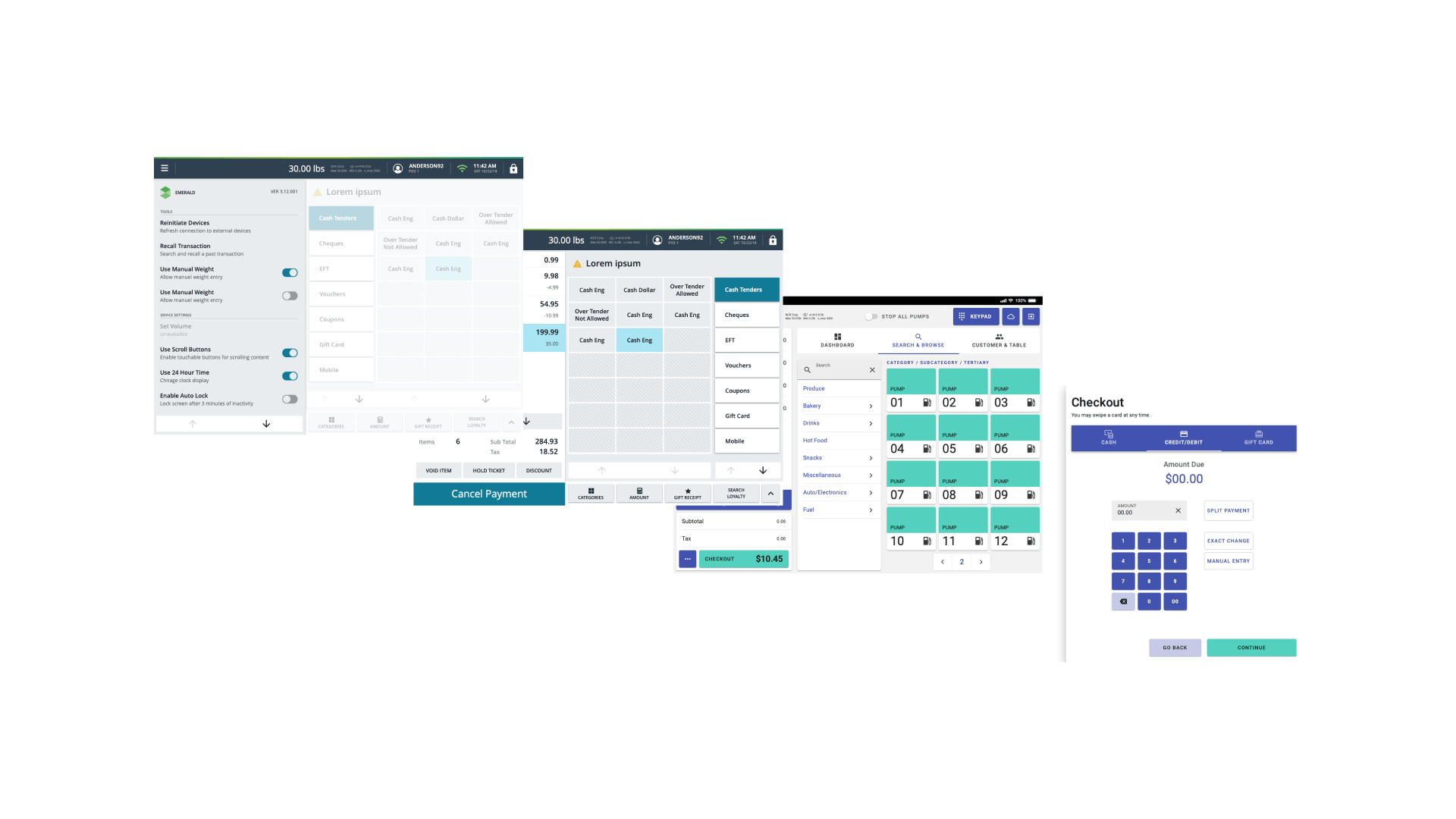
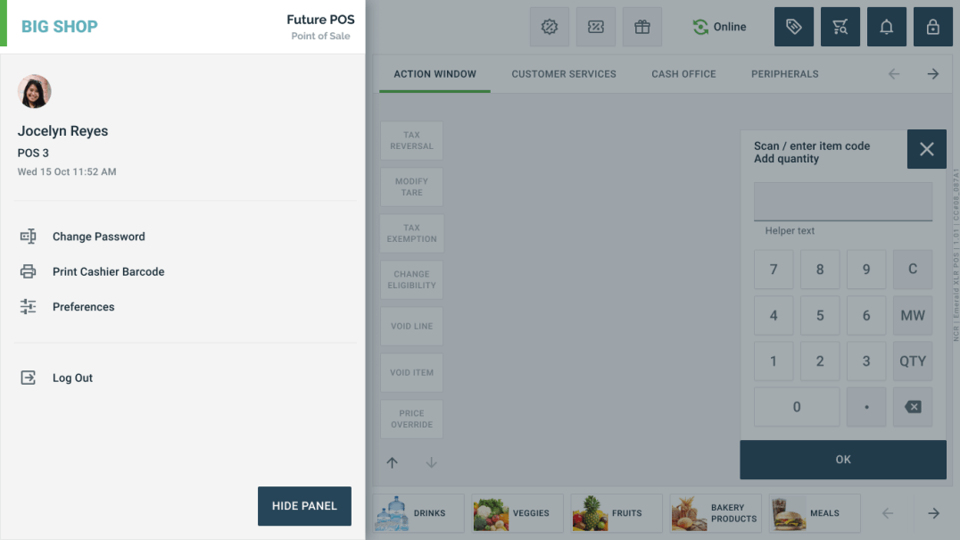
The basic task of scanning a product is simple and straightforward, but navigation is required to solve some tasks. For example, sometimes the standard flow involves searching for products or price (Price Query). Other situations include age-restricted items, recall or void transaction, department sale, price override, adding coupons or identifying a loyal customer.

Whenever navigation is involved, things can get very complicated. I had to deal with hierarchical structures and invested time into creating additional documentation to facilitate the work with the data, better articulate and distribute design rationale. Doing this upfront was quite time consuming, but saved a lot of back‐and‐forth as the project progressed.

Command levels

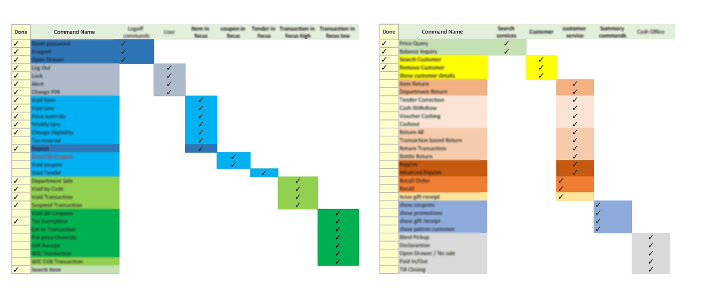
The content prioritization framework helped to create visibility into my decision‐making process
and encourage the team to share in the vision.

Navigation

There are 3 different modes: no-sale, sale and transaction.

The Execution

Detailed Design

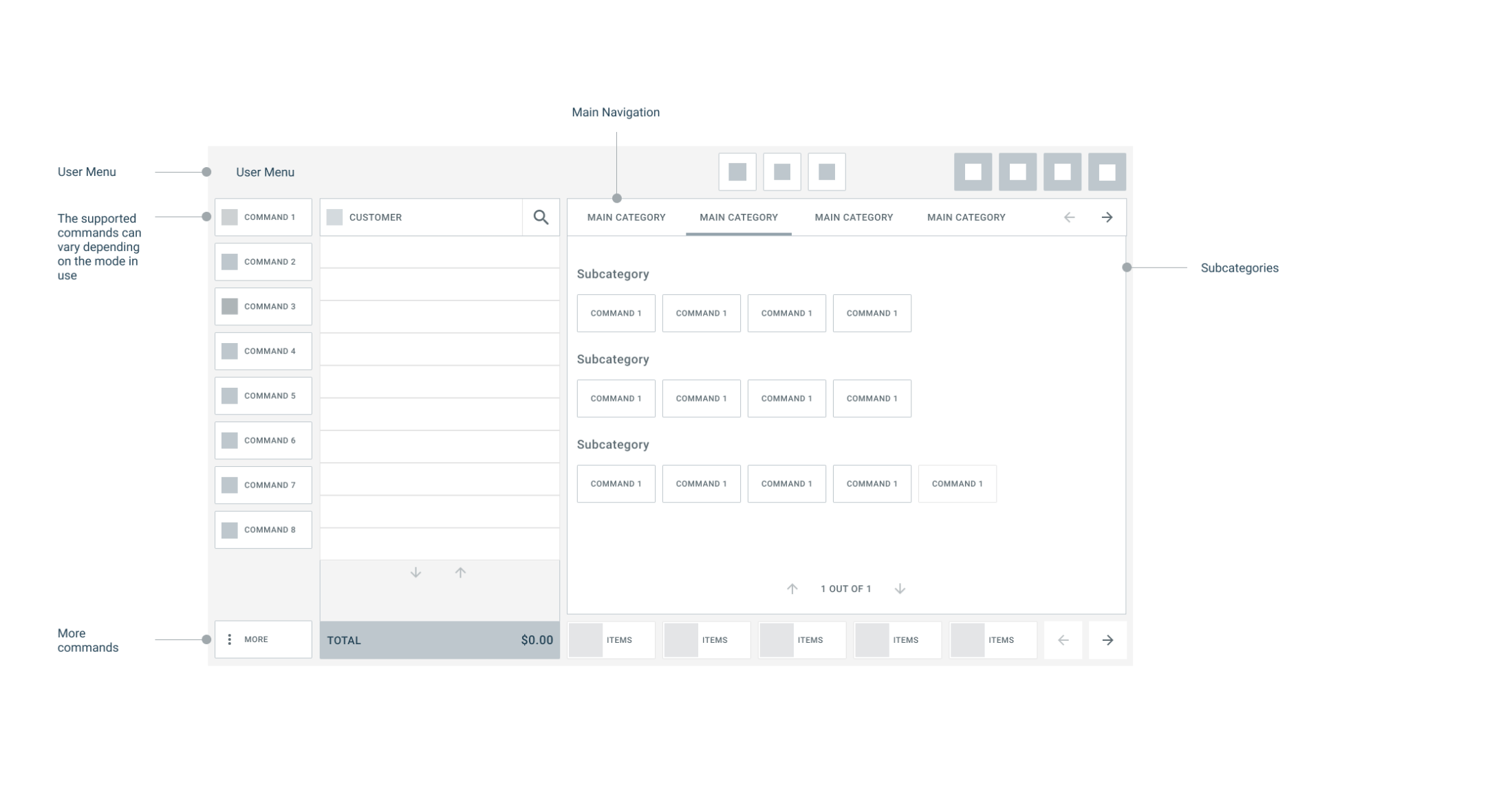
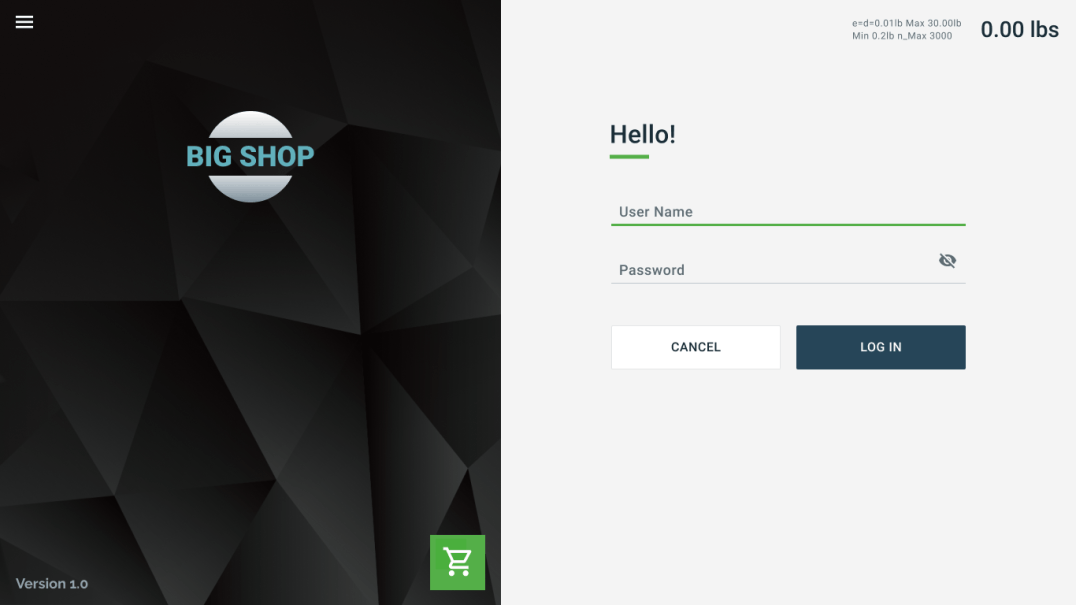
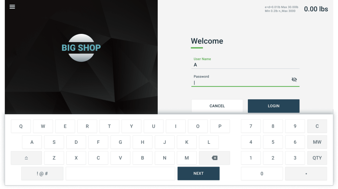
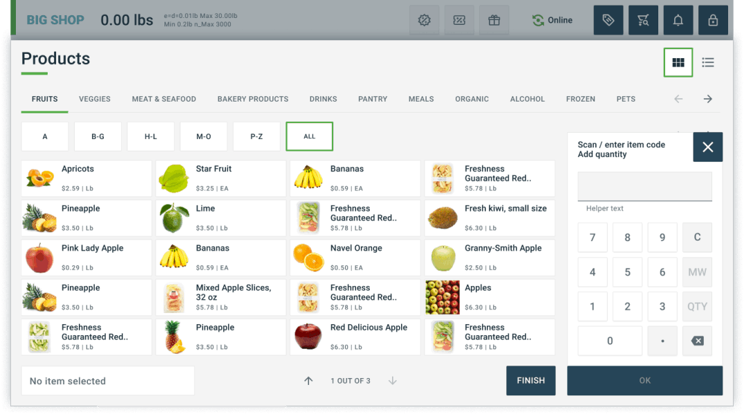
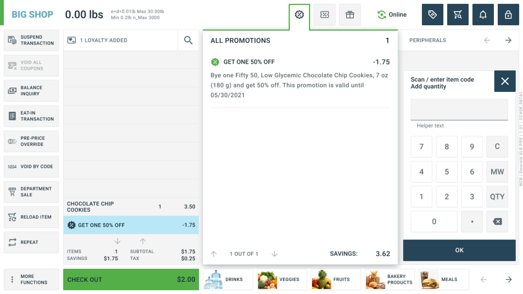
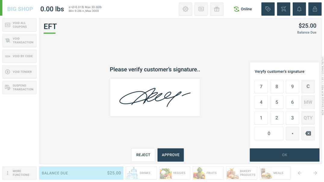
The gallery below shows some of the POS designs for Desktop.

Mock up
Mockup
Mockup
Mockup
Mockup
Mockup

Validation

Usability Test

To validate our assumptions we conducted usability test with 8 professional cashiers on both the Desktop and Mobile platforms of the Future POS Prototypes. The feedback from the participants was generally positive, but the number of findings and NPS score suggest that there is room for improvement.

It is better than the older systems that are used and can be easier to teach to new employees because of the new wave of Technology.
I feel as so after using this system after one or more use its fairly simple but for the first time not so much. Having the keypad disabled during the checkout process was a good idea to reduce confusion.
I believe just a little minor tweaking could really enhance the software as well as increase the use of the software by users. Therefore creating faster and more efficient customer service.
..This system is a great step towards moving technology for retail in a more intuitive direction. Simplicity and user friendly is a plus to me.

Conclusion

What I Learned

• I value simplicity and usefulness. I aspire to make people happy by designing experiences that just get out of the way. Craftsmanship and carefully thought out details are important to me.

• This is not about perfectionism, but rather an insistence for quality. Quality that should never be compromised, even in the first version of a product. Quality is the responsibility of an entire organization and I have learned that magical experiences are only possible if the whole team truly shares in the same values and aspirations.

2025 © Anatoly Slobodskoy